So this is the new Brooklyn Nets logo?
Options

will grimey
Members Posts: 4,740 ✭✭✭✭✭
Comments
-
Nets B? Really?
-
"All Black everything
? You know my fresh code"
-
It looks like it's missing something, it looks too plain. I like black, but they should substitute the white for something else.
Maybe black and red-orange. -
? wack... but looks unfinished.
-
Brooklyn Nets,B
-
Christie mad tho
-
damn so they just gon completely switch the colors of the unis?
-
Looks cooh
-
I like the simplicity of it. I think it'd be dope if they're just black and white similar to the Heat alternates.
-
They should do the Brooklyn Bridge alternative logo. This one is ok, its simple
-
Trash
-
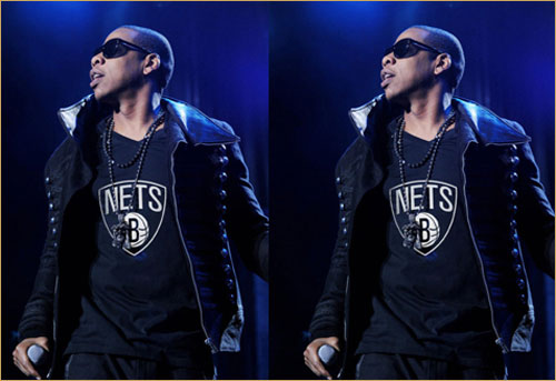
I read the Jay-Z one is a photoshop
-
The designer...jay z needs to be fired ..
This is wack -
wheres the K?
just B?
But i ? with it tho, "y now? /cuz its da home town" -
You know he gonna have alternate jerseys that are black & Jay Z Blue...

-
-
it might be the logo this is the hat

-
the logo was leaked and hasnt been confirmed yet but i wouldnt doubt if it was it. I think there should be a BK on the ball instead of just a B
-
Jay Won.......
-
Somebody has some mean Photoshop skills...co-sign the BK comment..
-
i like it, like some old school ish
-

i got this from a nets site its just something one of them made its a lil more clear -
logo is ok
-
@eyeslow the logo is still wack, i thought they was gonna bite the mets n yankees, but instead of using the NY , use BK
as in combine the B and the K, like how the mets and yankees combine the N and the Y on their logo's -
Why the change tho? They should just leave the colors and logo the way they were. Just remove the new jersey and add Brooklyn.